Phi Studio
2022Shenzhen
○ Branding
○ Logo Design
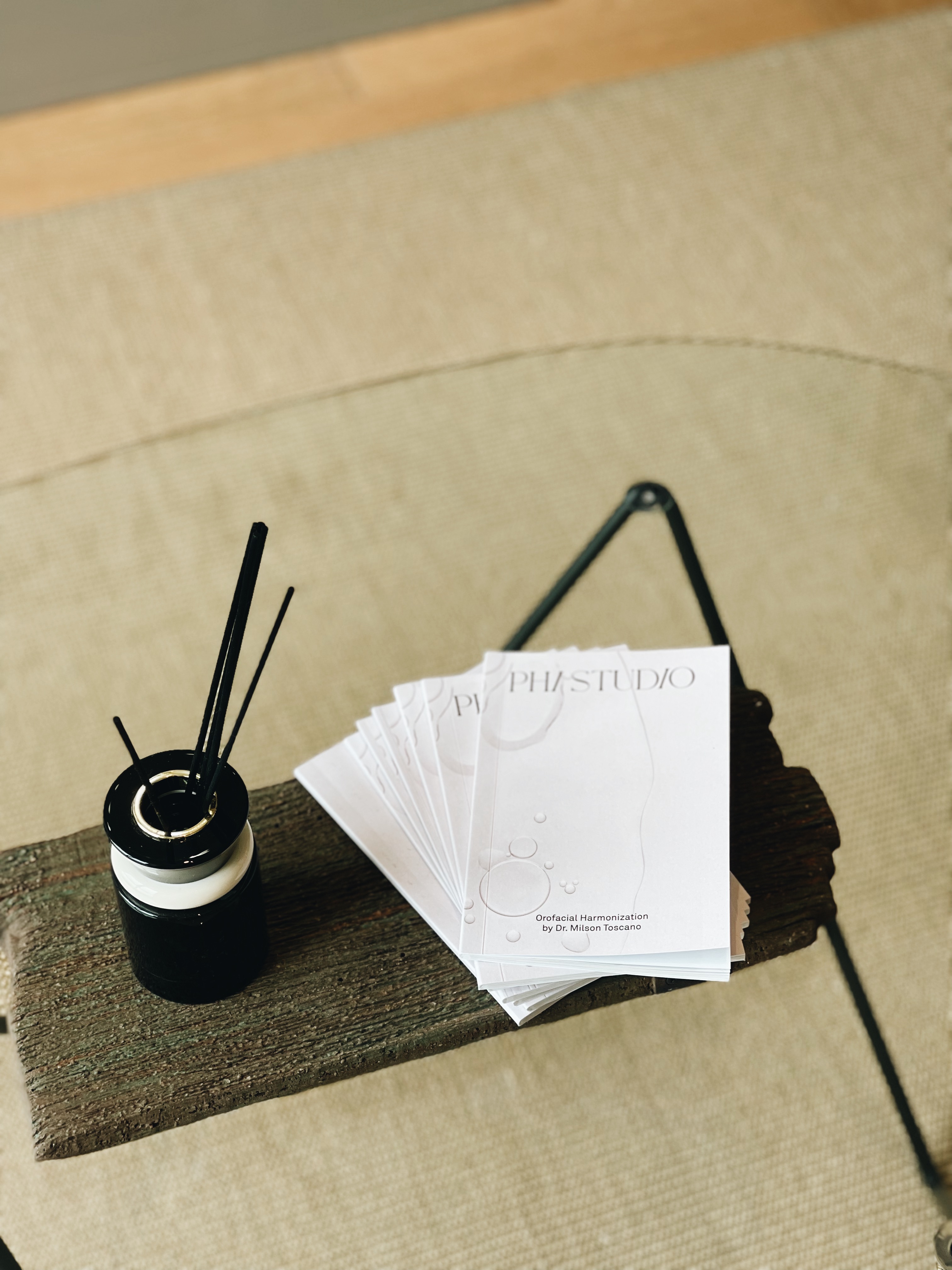
○ Merch Design
○ Menu Design
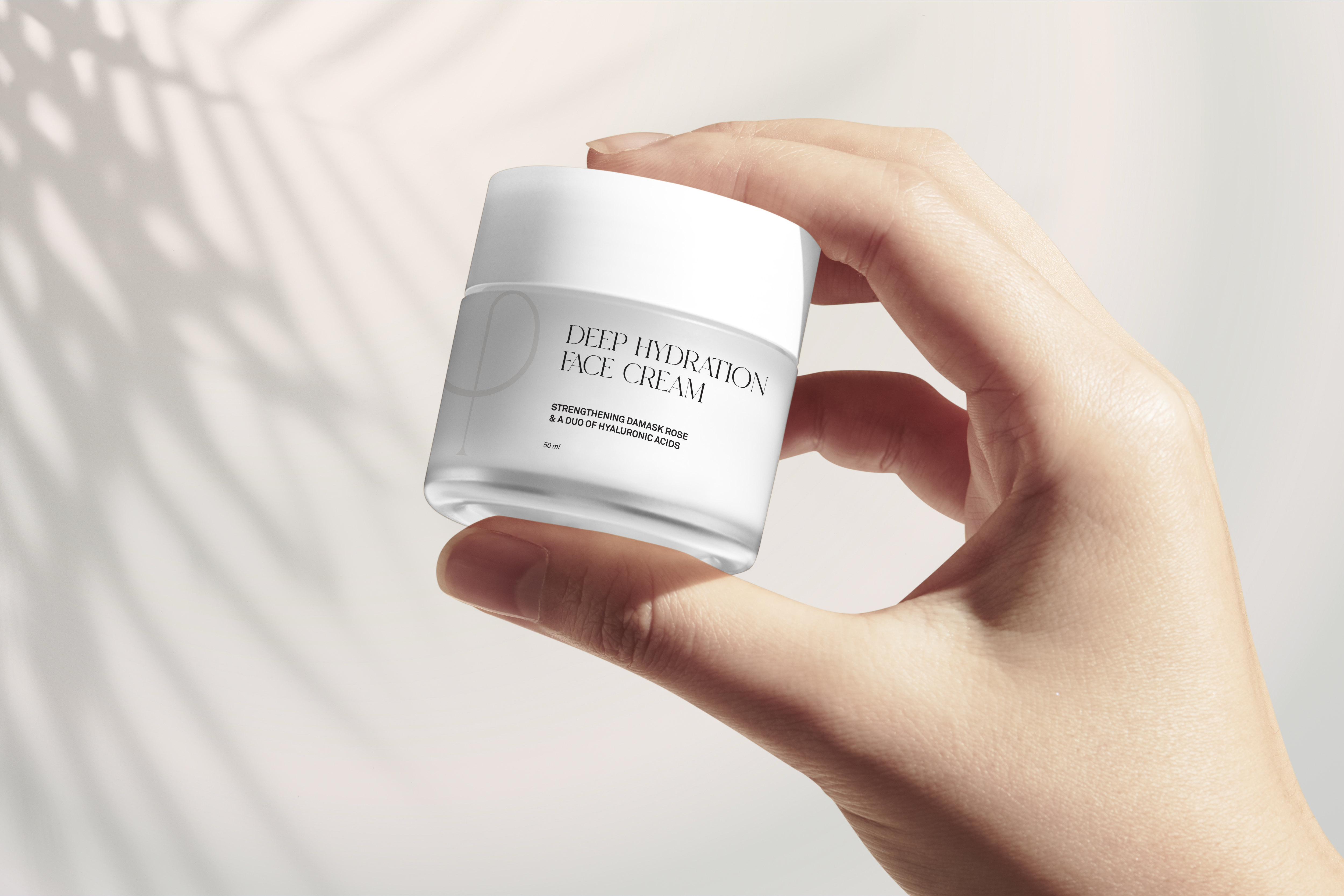
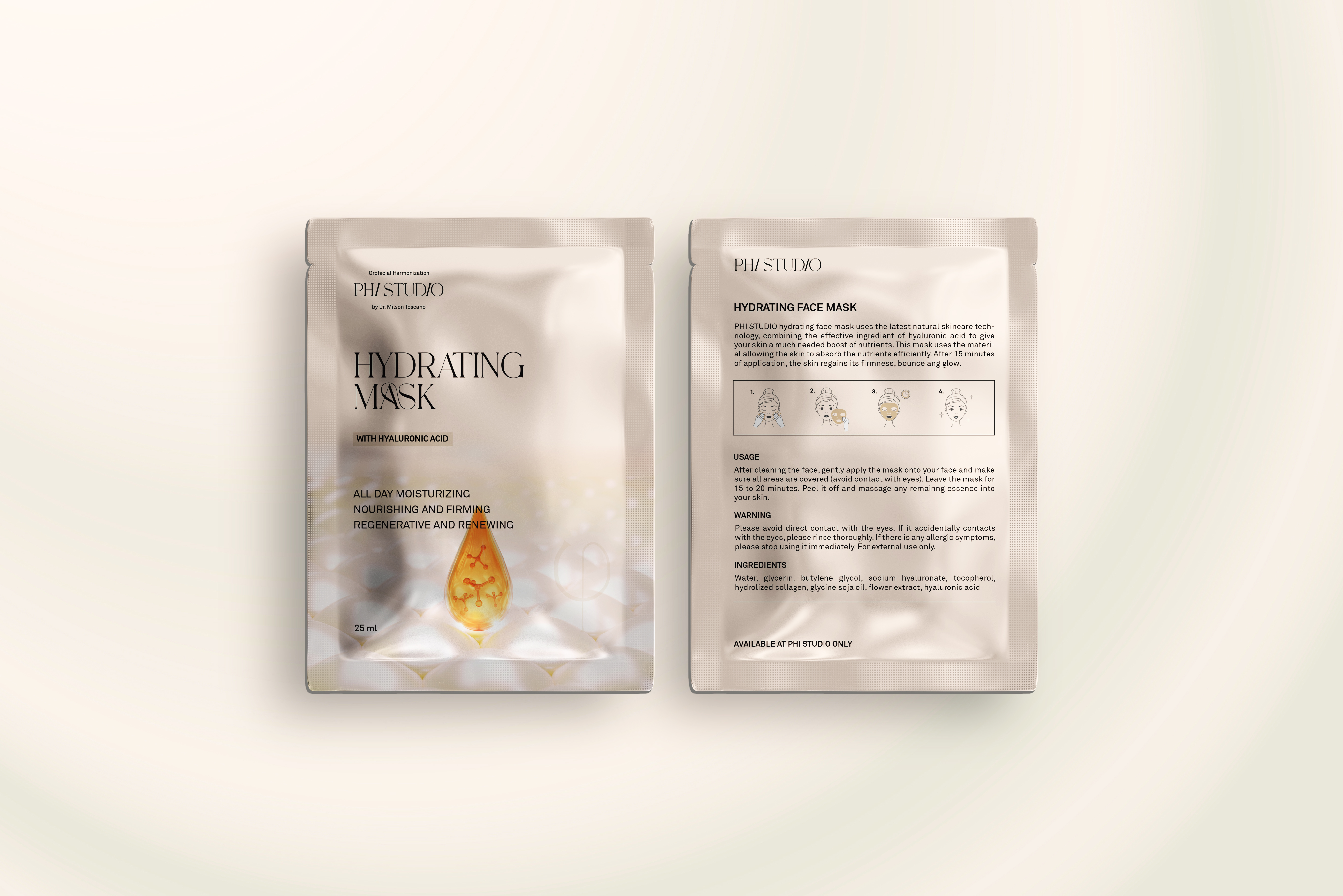
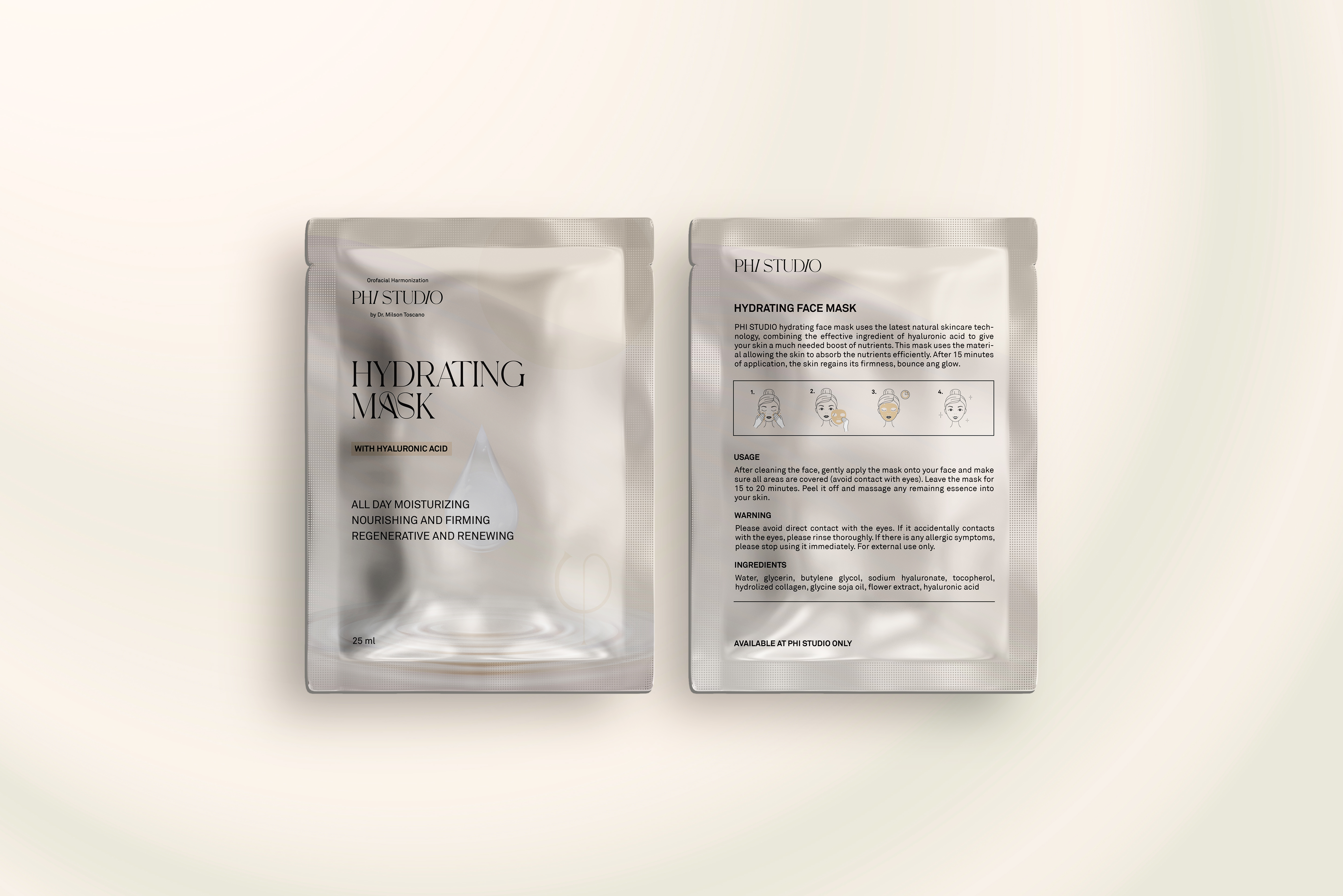
○ Package Design
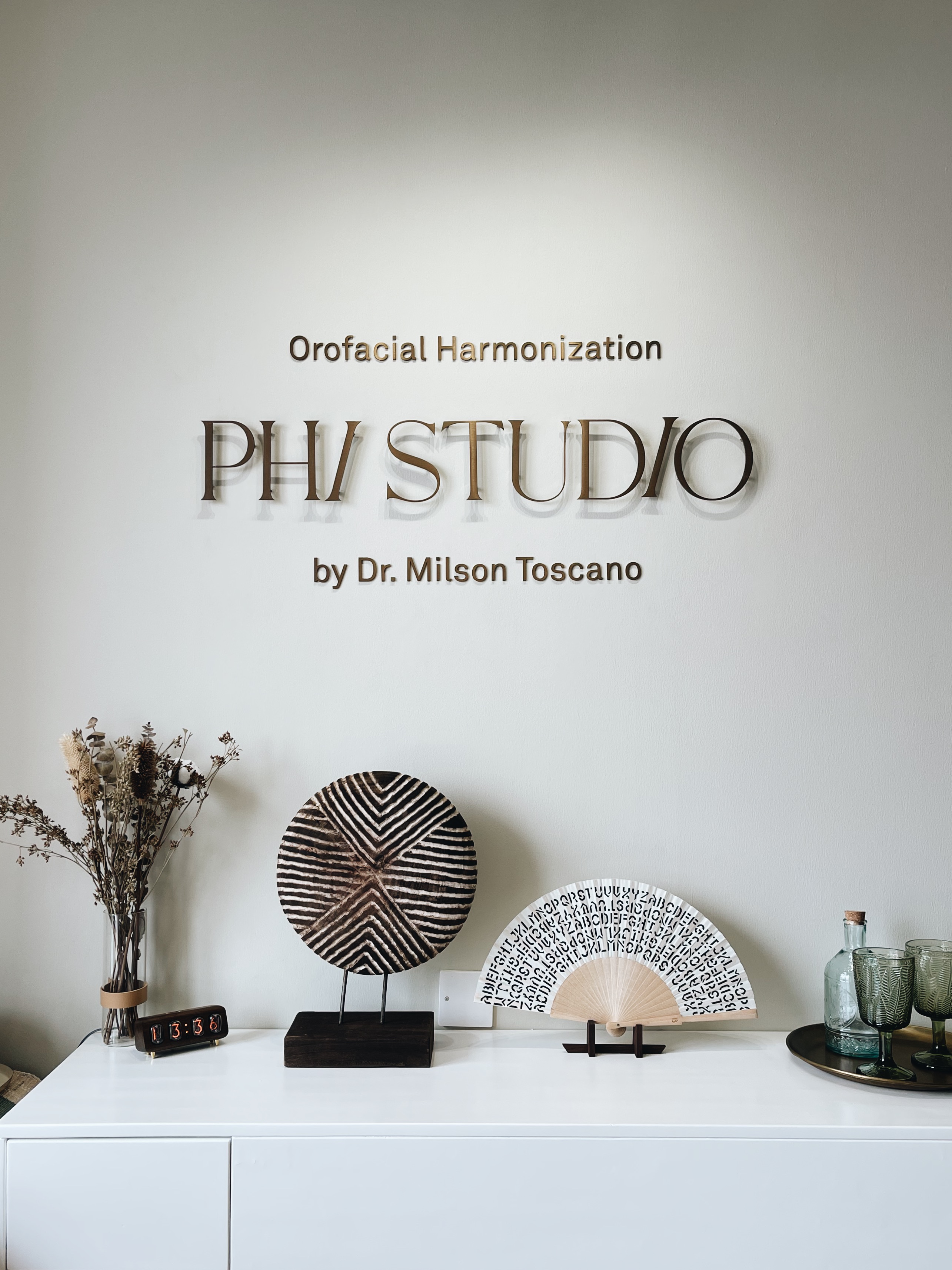
○ Space Design
Brand concept
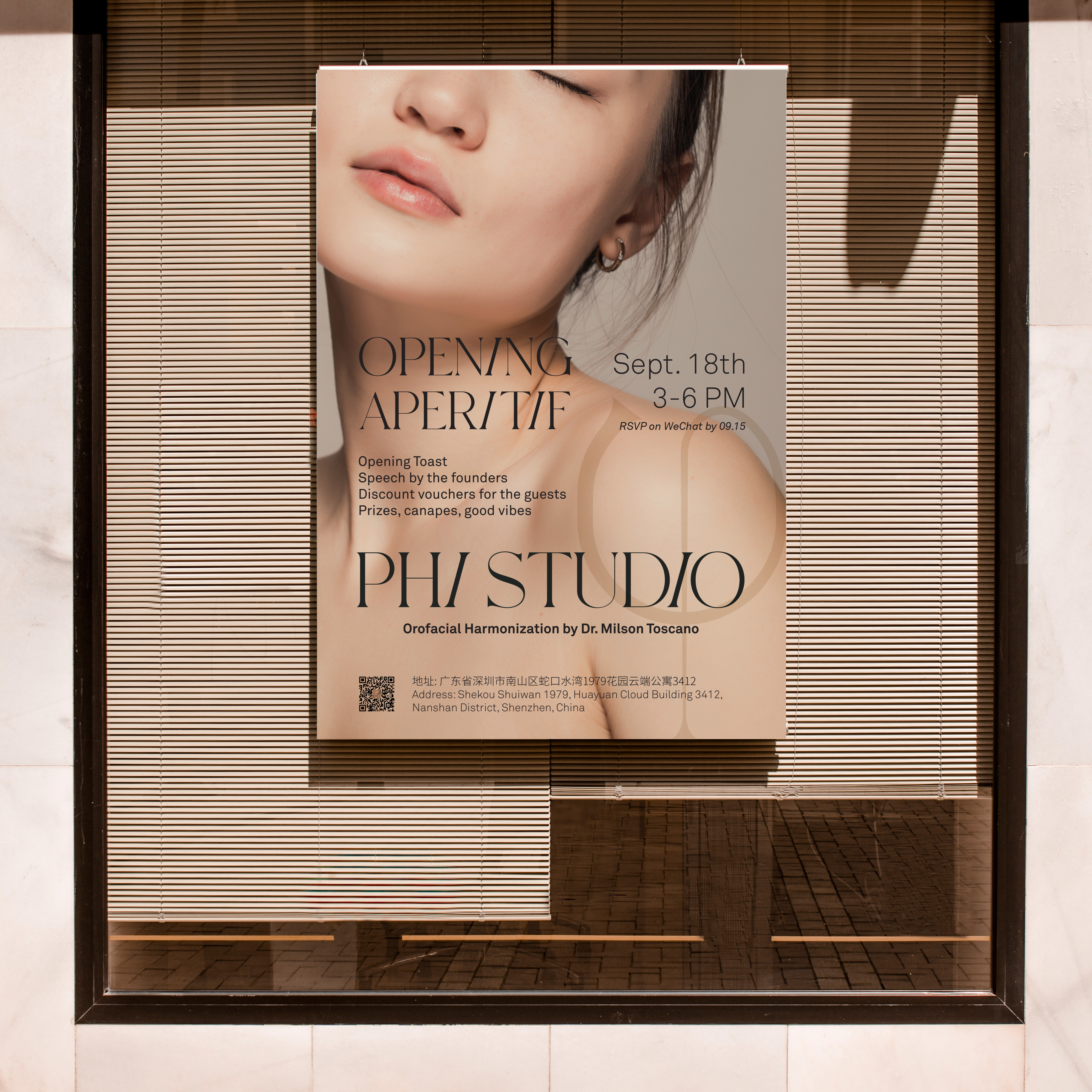
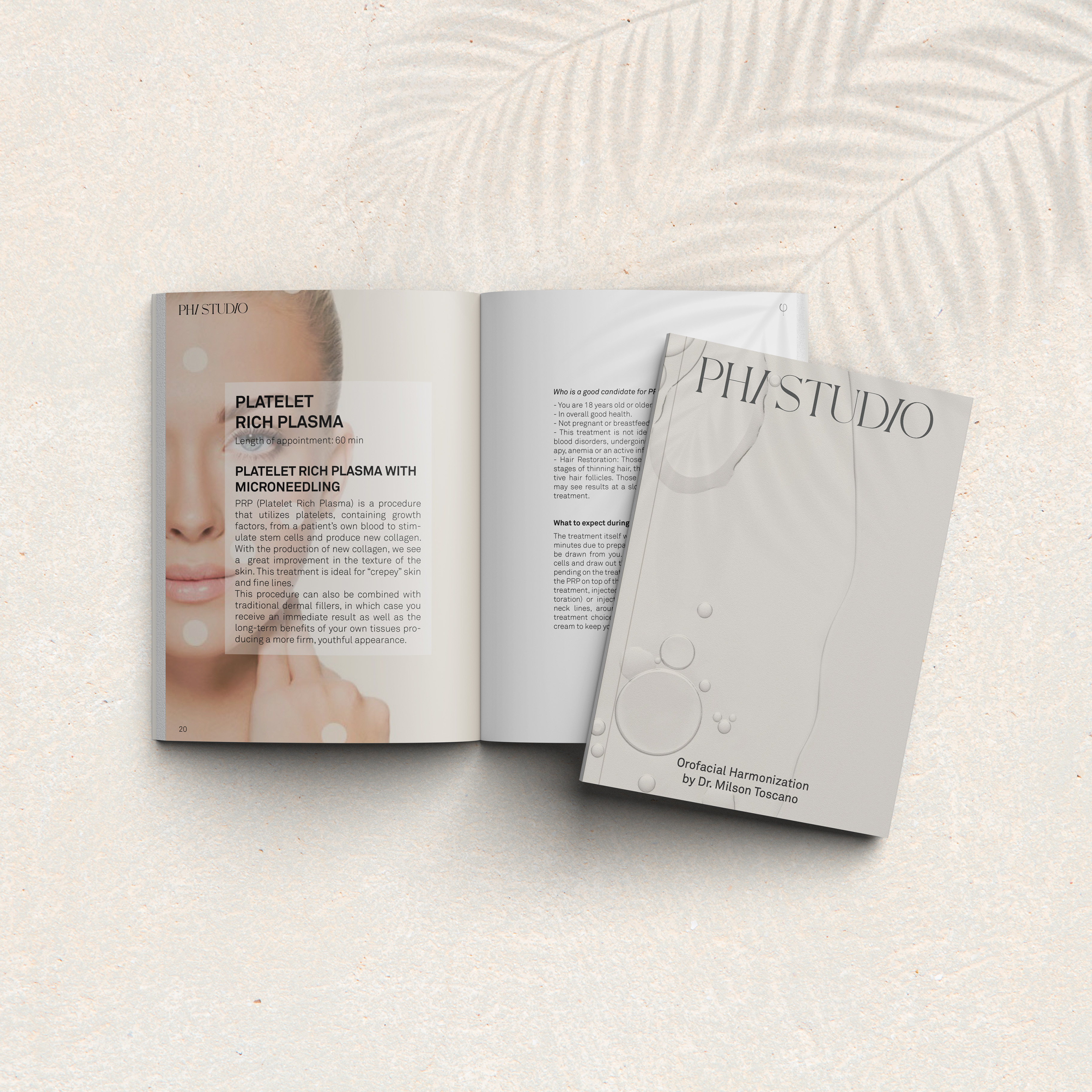
Phi Studio is a prestigious beauty salon nestled in the cosmopolitan city of Shenzhen. Named after the Greek letter Phi, symbolizing the golden ratio, Phi Studio specializes in orofacial harmonization, embracing the principles of symmetry and balance. Our design approach is a reflection of this refined philosophy.
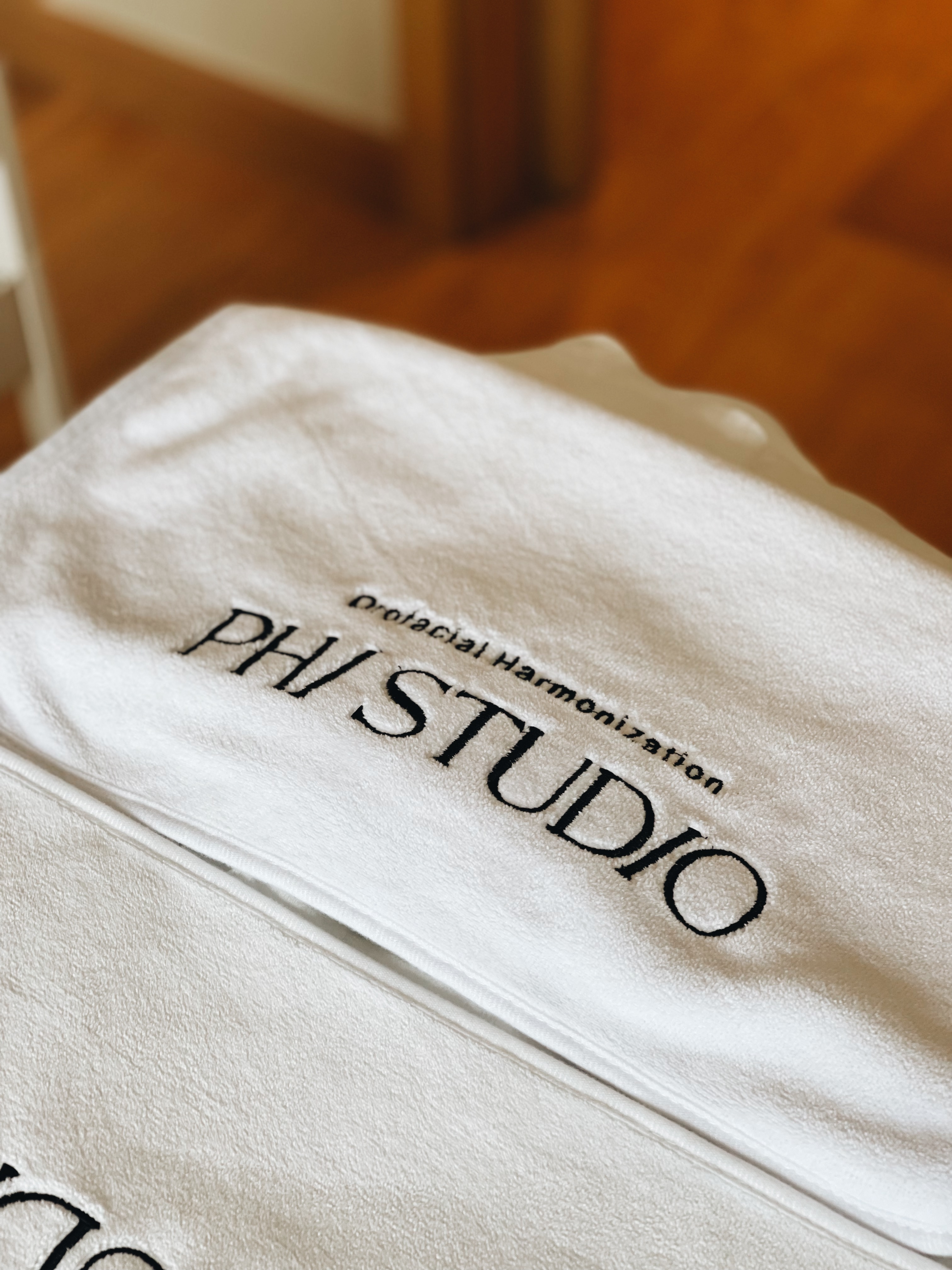
Logo design
The Phi Studio logo is a masterpiece of refinement and elegance. The thin and gentle lines capture the essence of the golden ratio, symbolizing balance and symmetry. The elegance of the logo reflects the studio's dedication to providing beauty services that harmonize and enhance the natural features of each individual, creating a visual language that speaks to precision and sophistication.
Color Palette
The color palette draws inspiration from the diverse and beautiful spectrum of skin tones. Shades of different skin tones, ranging from fair to deep, are woven into the color palette, creating a warm and inclusive ambiance. This diverse palette not only celebrates the unique beauty of each client but also reflects Phi Studio's commitment to providing personalized and harmonizing beauty services.