Ratafia Rossi
2023Hong Kong
○ Branding
○ Logo Design
○ Package Design
○ Creative Direction
Brand concept
Ratafia is fortified wine rooted in centuries-old recipes, and for Ratafia Rossi we brought tradition into our days. This brand, bearing the name of its founder Simone Rossi, marries Italian tradition with the dynamism of Hong Kong. Ratafia Rossi is a fusion of timeless tradition and contemporary vibrancy, echoing the journey from the founder’s historic roots of Grosseto, Italy, to the bustling energy of Hong Kong. Our brand essence embraces the Italian current of futurism, a movement that celebrates progress, bold ideas, and a forward-looking mindset.
Logo design
At the heart of Ratafia Rossi's visual identity is a logo that fuses the futurism movements with tradition. The bold letters and industrial typography reflect the dynamic spirit of futurism, while the two stars in the circular logo pay homage to Grosseto and Hong Kong. The star-shaped Grosseto walls city planimetry and the iconic Star Ferry in Hong Kong inspire these elements, symbolizing the life journey of the founder.
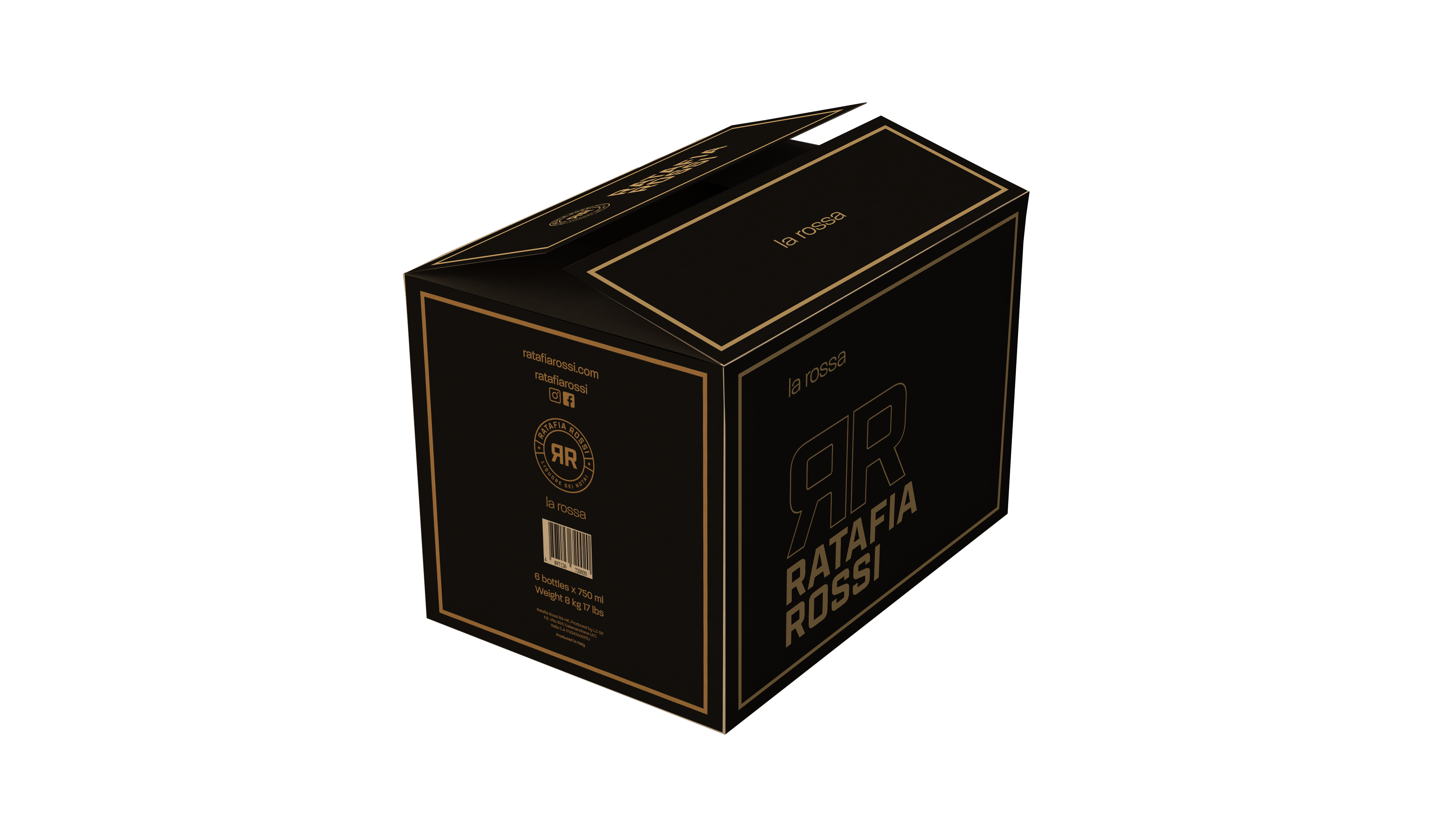
Color palette
The color palette of Ratafia Rossi is a sophisticated combination of gold, white, and black. Gold exudes elegance and warmth, white adds a touch of purity, and black conveys a sense of mystery. This palette not only reflects the refinement of the fortified wine but also mirrors the brand's commitment to quality and innovation.
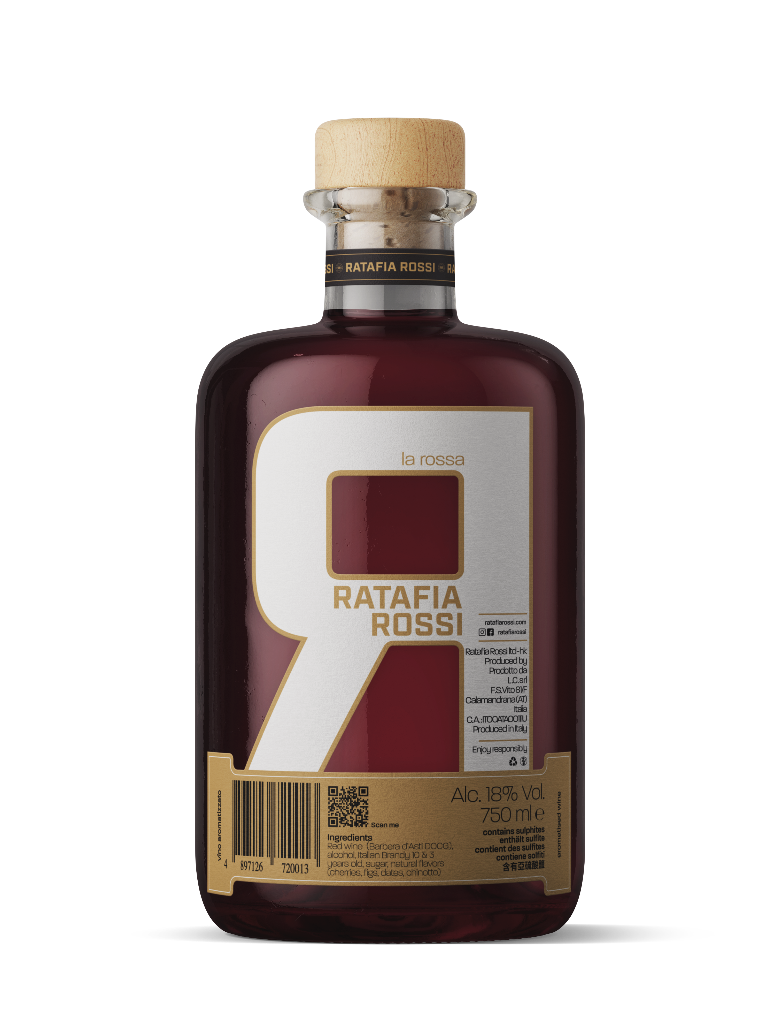
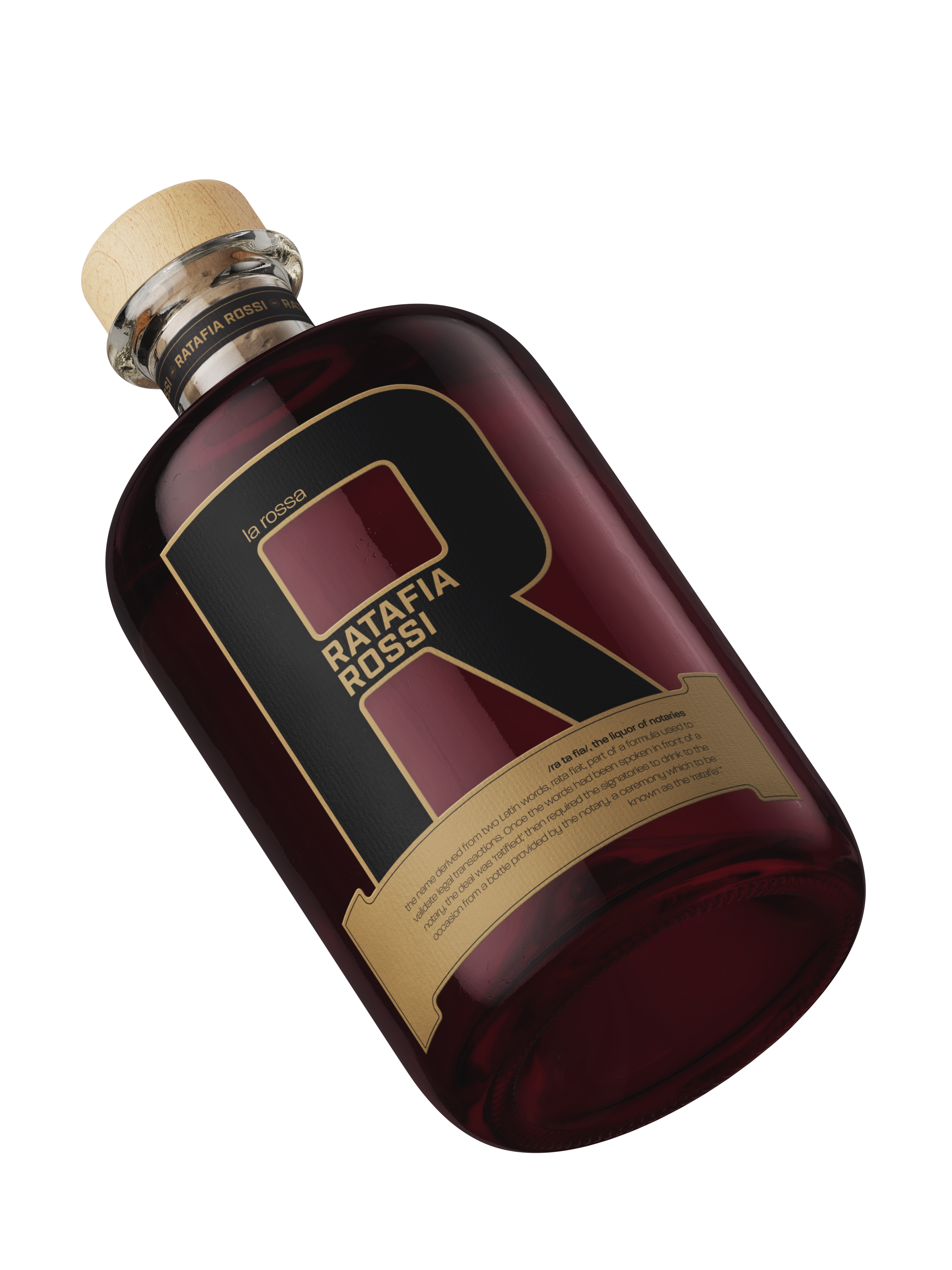
Bottle Label
The bottle label is a minimalist masterpiece, featuring a black R on one side and a white R on the other. This design not only represents the duality of tradition and modernity but also invites consumers to appreciate the complexity within the simplicity of the branding.